
Starting From Nothing
When Tuwaiq Pay came to the table, there was no website.
The product existed — a Saudi payment platform built for freelancers and businesses, letting them collect payments through SoftPOS, shareable payment links, and e-commerce integrations — but there was nowhere online that explained what it was, who it was for, or why someone should trust it with their money.
The brief was to build that presence from the ground up. A full marketing website, in both Arabic and English, that could speak to a Saudi business audience and convert visitors into sign-ups.
This was a zero-to-one project. No existing site to reference, no design system to inherit, no previous copy to work from. Every decision — architecture, visual language, copy hierarchy, component structure, bilingual approach — was made from scratch.
Understanding the Product First
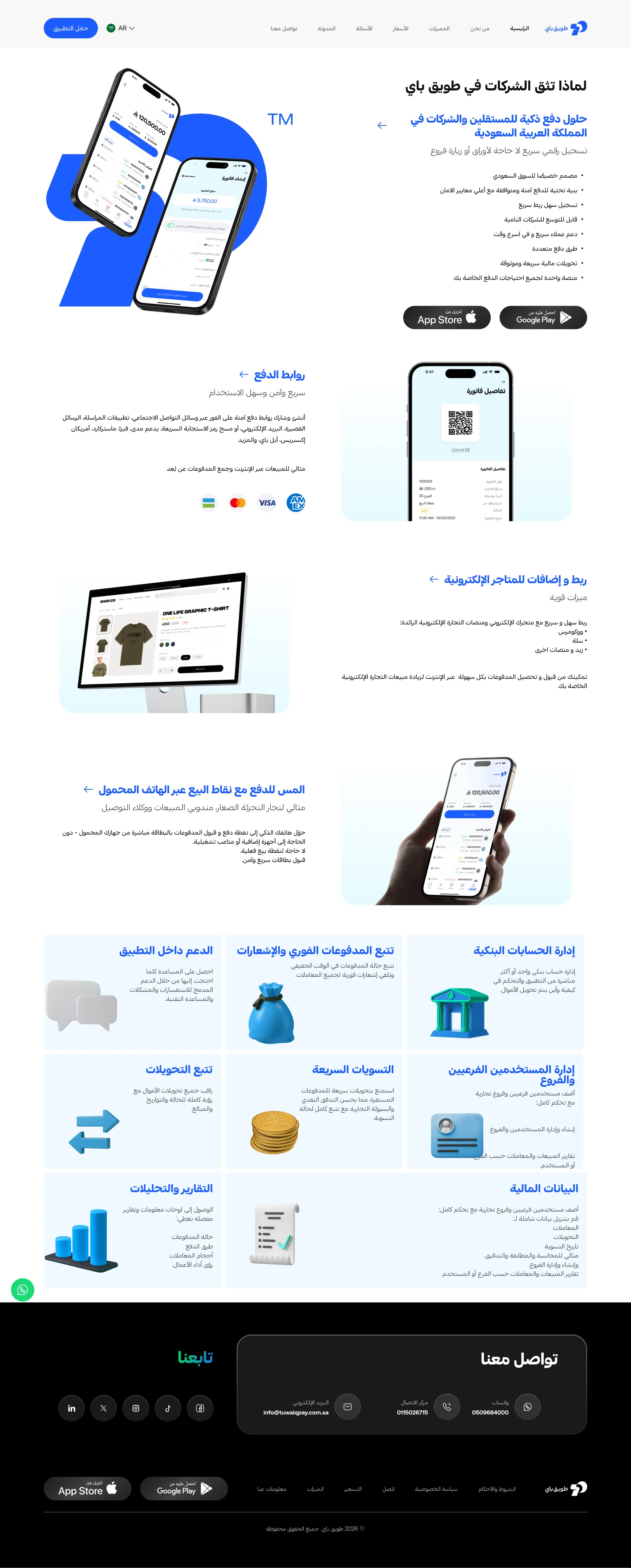
Tuwaiq Pay isn't a consumer app. It's a B2B payment tool — which means the website's job isn't just to look good. It's to answer the questions a business owner or freelancer asks before they hand a payment platform access to their sales.
Three core capabilities needed to be communicated clearly, separately, and in a way that helped different types of visitors immediately recognize which one was for them.
Turn any smartphone into a payment terminal. No hardware, no physical POS device, no setup friction. Accept card payments on the spot — ideal for small retailers, sales reps, and delivery agents.
Generate and share secure payment links via social media, messaging apps, SMS, email, or QR code. Supports Mada, Visa, Mastercard, American Express, and Apple Pay. Perfect for online sales and remote collections.
Connect directly to WooCommerce, Salla, Zid, and other platforms via custom APIs. Enable checkout payments at scale — for online store owners who need seamless integration without technical overhead.
Six Pages, One Coherent Journey
The website was structured across six pages, each with a distinct job. Together they form a complete conversion path — from first impression to sign-up.
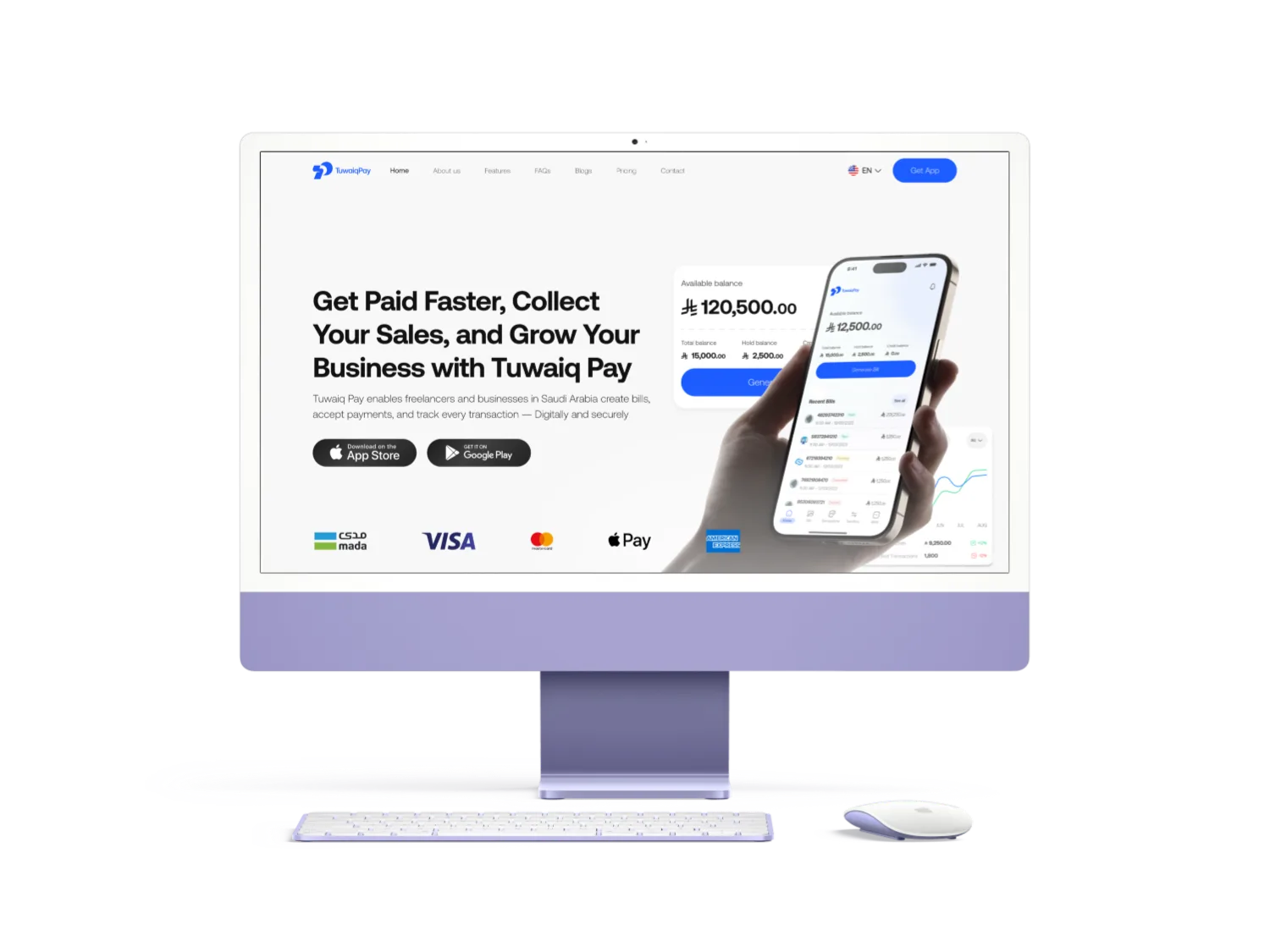
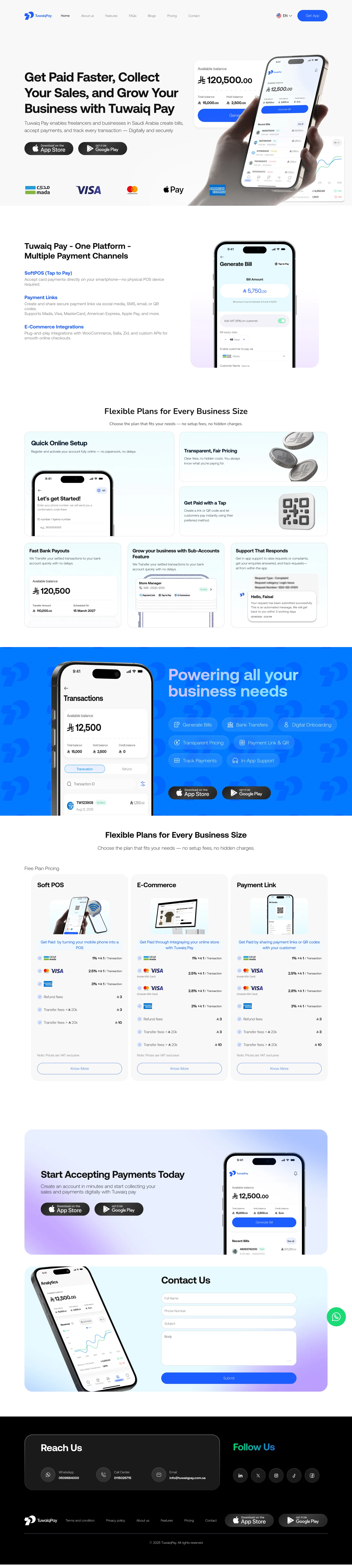
Home
The entry point. Leads with the core value proposition — get paid faster, collect sales, grow your business — and introduces all three payment channels above the fold. Pricing tiers, feature highlights, and a final CTA to download the app or start an account.
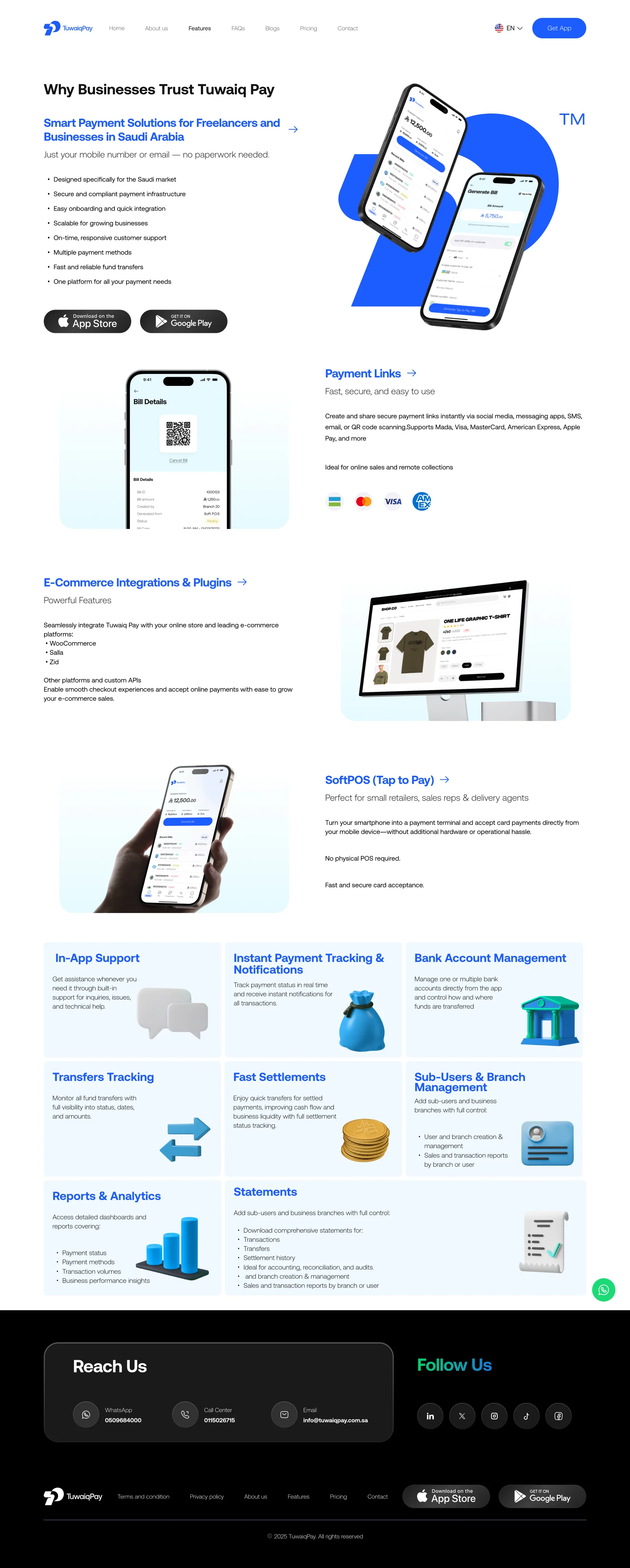
Features
A dedicated deep-dive into every product capability: Payment Links, E-Commerce Integrations, SoftPOS, In-App Support, Instant Payment Tracking, Bank Account Management, Transfers Tracking, Fast Settlements, Sub-Users & Branch Management, Reports & Analytics, and Statements. Enough detail for a business owner to evaluate without a sales call.
Pricing
Three plan types across three payment channels (SoftPOS, E-Commerce, Payment Link), each with transaction fees and transfer costs clearly broken down. No hidden charges — transparent by design.
FAQs
Answers the questions that would otherwise stop someone from signing up. Reduces friction at the decision point without requiring a support interaction.
Blogs
Content for SEO and trust-building. Establishes Tuwaiq Pay as a knowledgeable presence in the Saudi payments market over time.
Contact
WhatsApp, call center, and email. Kept simple and accessible — because in B2B, being reachable is part of the product.
Built Around Confidence and Clarity
The visual language was built around the two things a payment platform has to project before anything else: confidence and clarity.
The primary blue is consistent across every surface, paired with high-contrast white space and real product screenshots showing the app in use. Payment method logos — Mada, Visa, Mastercard, Apple Pay, American Express — appear early and prominently. In a market where payment trust is everything, showing the logos merchants and customers already recognise is doing real work.
Typography is large and direct. Headlines lead with business outcomes, not product features: "Get Paid Faster, Collect Your Sales, and Grow Your Business" — not "A payment platform with multiple channels."
The feature sections use a consistent alternating layout — visual on one side, copy on the other — so the page has rhythm without feeling repetitive. The feature grid gives a full-picture view of everything the platform does, laid out to reward someone who wants to go deep without blocking the path of someone who just wants to sign up.
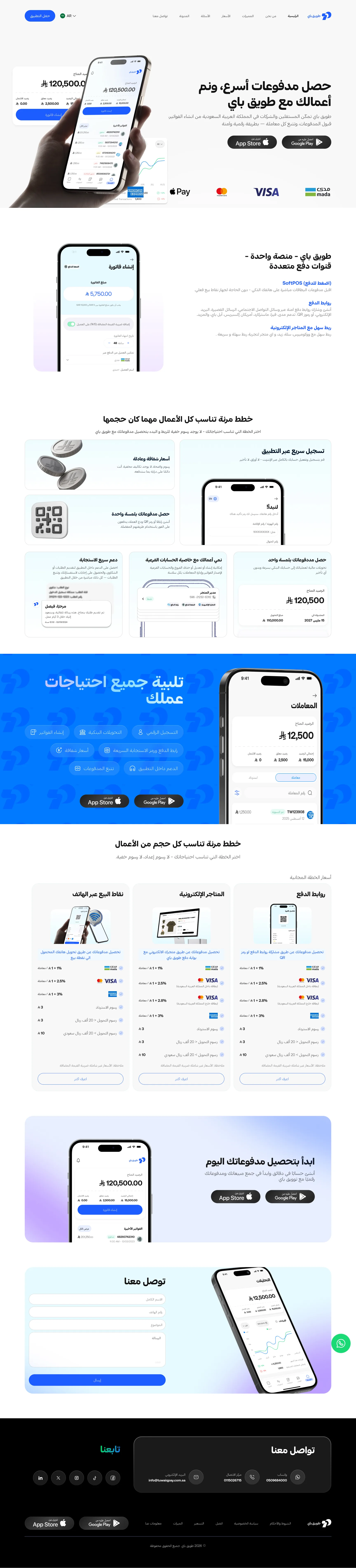
Arabic and English — Both Designed, Not Translated
Both versions of the website were designed in full. Arabic is RTL and required more than flipping text. Every layout element, every icon direction, every visual hierarchy had to be reconsidered in the context of how Arabic readers scan a page.
To make this scalable and consistent, the component system in Figma was built with directional variants — each component has an LTR and RTL version that can be switched without rebuilding anything. The same components. The same logic. Two directions.
The result is a website where neither version feels like an afterthought. Arabic visitors get a website that reads the way Arabic reads. English visitors get the same.
Every Capability, Clearly Explained
The Features page goes deeper than any homepage can. Each product capability is laid out with enough detail for a business owner to evaluate on their own — from Payment Links and SoftPOS to Bank Account Management, Sub-Users, Reports, and Statements. No sales call required.
The same bilingual approach applied here — the RTL variant of every section was designed as a first-class layout, not a mirror flip.
Mobile-First Where It Matters
The full website adapts to mobile — which matters because the primary audience for a payment app used by freelancers and small retailers is going to be on their phone. A merchant accepting tap-to-pay on their smartphone isn't signing up on a desktop.
The mobile layout prioritises the core conversion path: value proposition, key features, pricing, download. Everything that supports that decision is still there — sequenced for a smaller screen and a faster scroll.

What This Was
This was a zero-to-one project. No existing site to reference, no design system to inherit, no previous copy to work from. Every decision — architecture, visual language, copy hierarchy, component structure, bilingual approach — was made from scratch, in collaboration with the founder and COO, and built to support a product that was itself still finding its market.
The website gives Tuwaiq Pay a presence that matches the ambition of the product: clear about what it does, honest about what it costs, and built for the market it's actually selling into.