
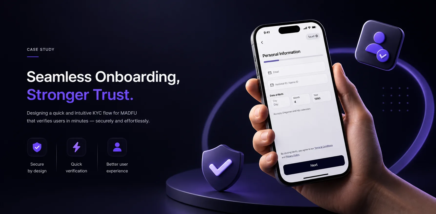
The Number That Started Everything
When I joined this project, Madfu's onboarding conversion rate was 14.65%.
That means more than 85 out of every 100 people who tried to sign up never made it through. They started the process, hit something along the way, and left. A wall, a confusing screen, a form that asked for too much at once.

Madfu is a Buy Now, Pay Later platform operating in Saudi Arabia. In a market where trust is everything and competition for attention is relentless, losing that many users before they ever reach the product is not a UX problem. It is a business problem.
The brief was to fix the KYC and onboarding flow across two surfaces: the Consumer App and the iFrame, which is Madfu's embedded payment gateway used at merchant checkout. That meant starting at the very beginning, before the first input field, before the first screen of the flow itself.
What Was Broken
The original experience had problems at every layer — from the first second a user opened the app to the final step of identity verification.


Splash Screen & Welcome Carousel
The old splash screen was a single static frame: the Madfu logo centred on a light blue background. Nothing moved. There was no transition into the experience.
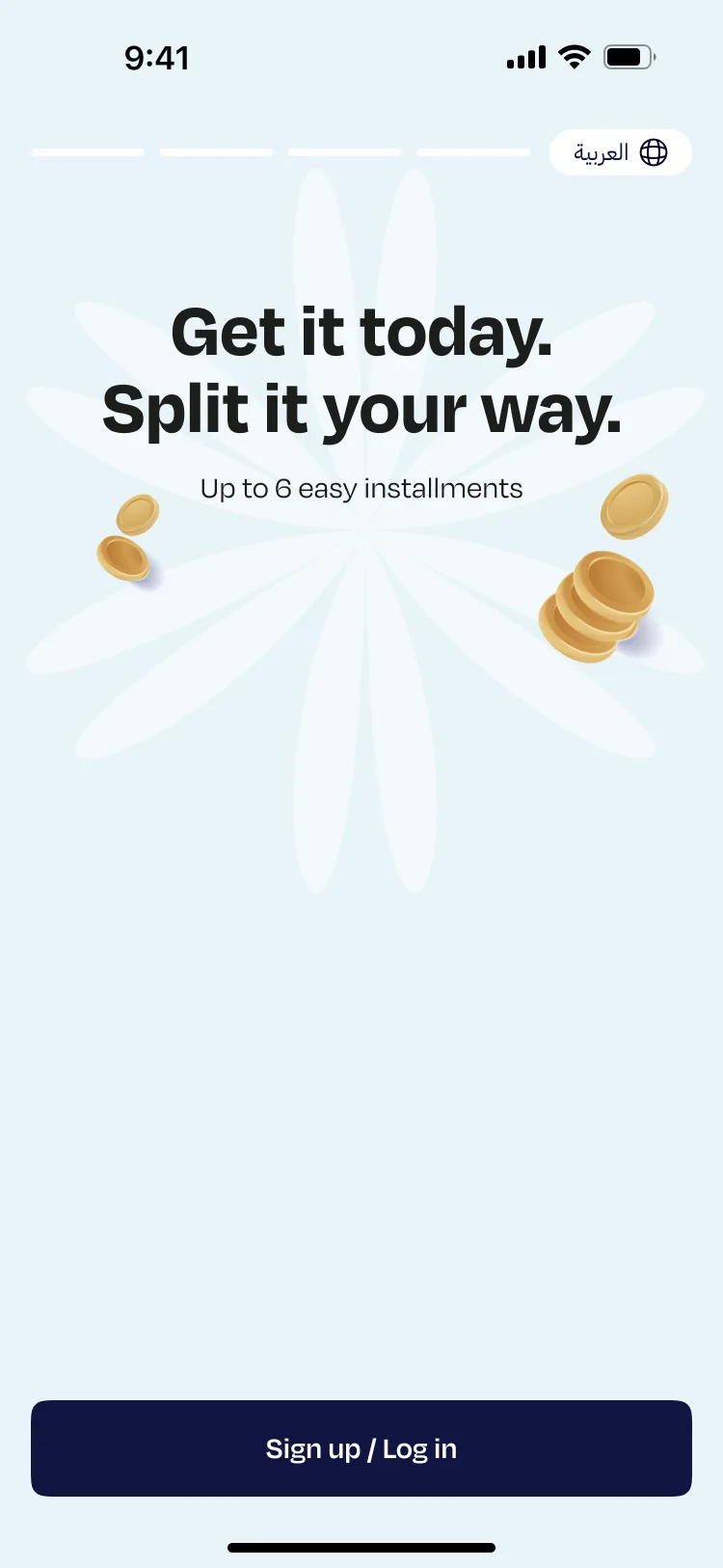
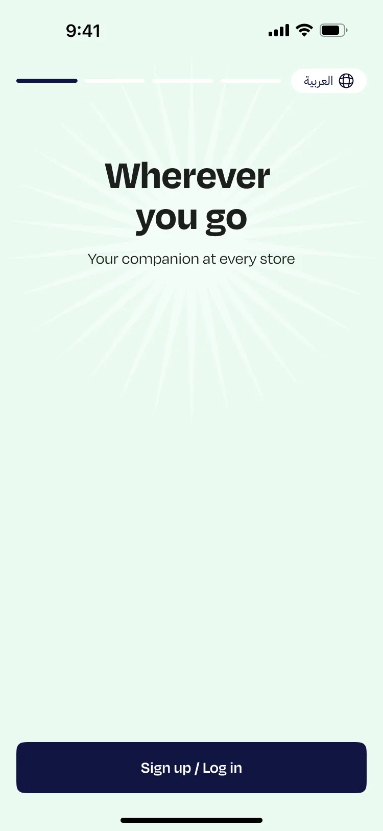
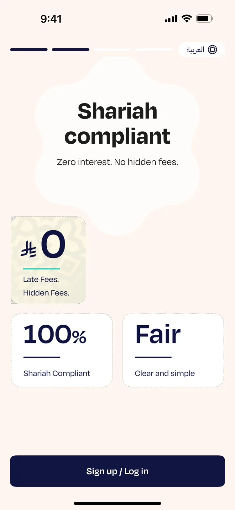
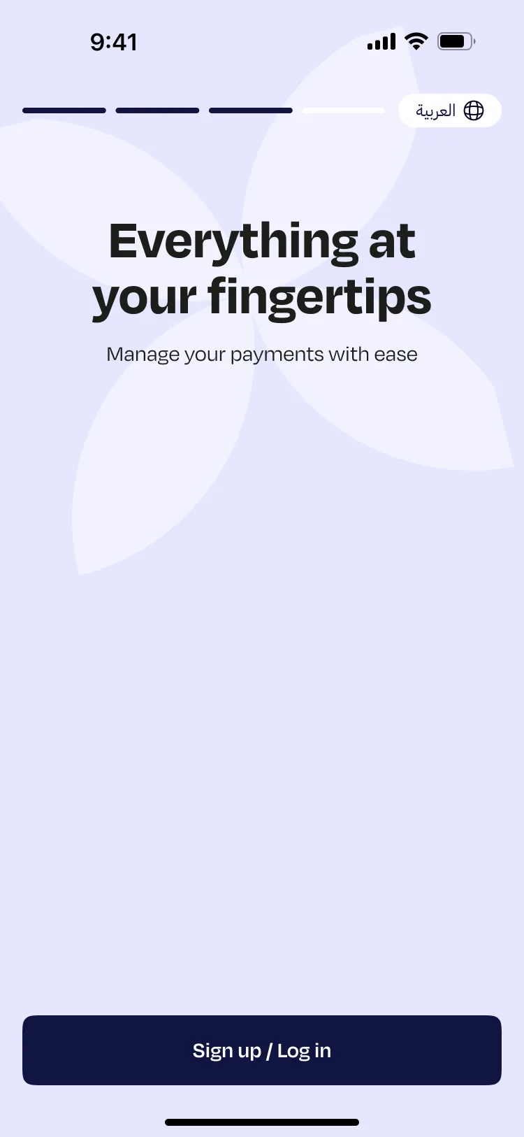
What followed was a four-slide welcome carousel, each slide built on the same two-tone template. A 3D illustration on top, a dark navy panel with text below. The illustrations felt generic and the copy read like it had been translated rather than written. "Do not let special moments pass without enjoying them" was one of the lines. "Lenient Sharia" was used as a headline, a phrase that carries real weight in the Saudi market but needed far more care in how it was framed.
Four slides, the same layout, the same structure, and no real reason to read any of them. Users either skipped immediately or arrived at sign-up having absorbed nothing about why Madfu was worth their time.
The Consumer App Flow
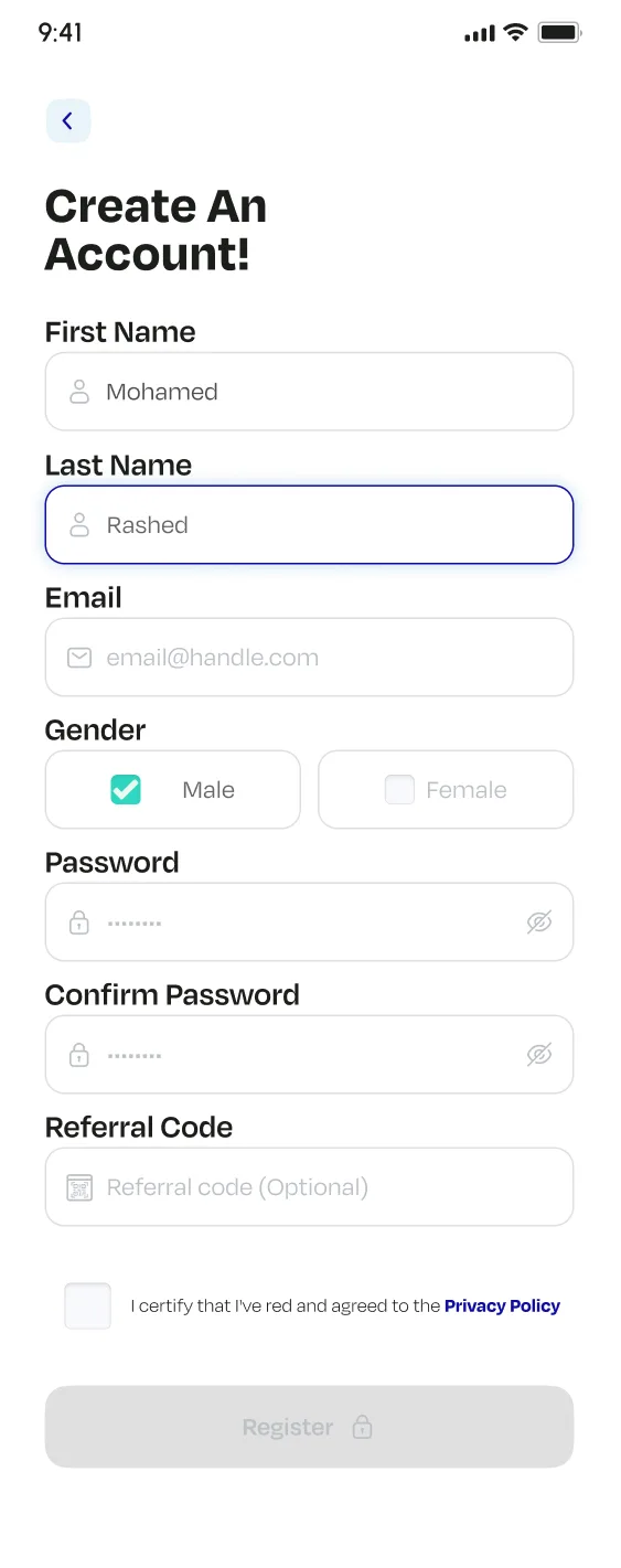
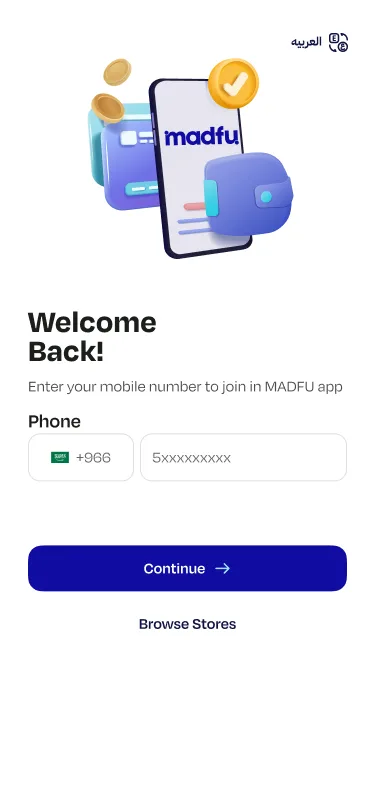
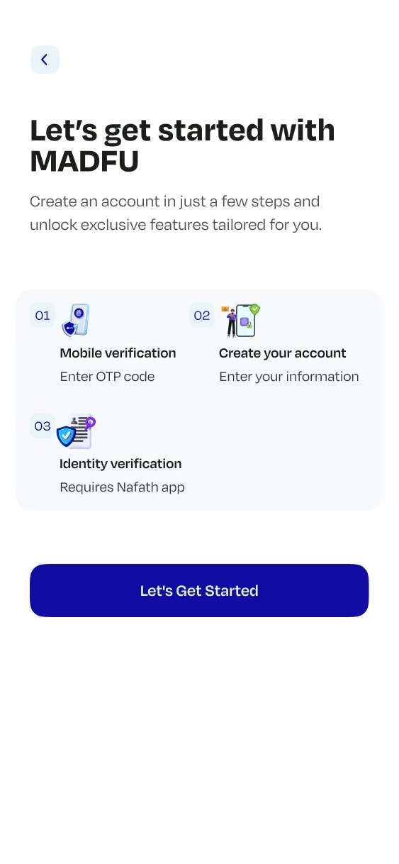
The sign-up screen greeted new users with "Welcome Back!" which is immediately the wrong message for someone who had never opened the app before. The screen that followed was a full overview of the steps ahead, a list of what was about to happen before anything actually happened.
Then came the form. One screen. Everything stacked on it: first name, last name, email, gender, password, confirm password, referral code, and a privacy policy checkbox, with a greyed-out Register button waiting at the bottom.
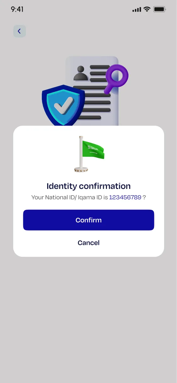
Large decorative 3D illustrations consumed the top third of every screen. The Nafath verification screen, which is the most unfamiliar step in the entire flow for most users, carried the headline "From Nafath app select" and offered two buttons with no clear instruction on which to tap or when. A confirmation modal then interrupted mid-process to re-confirm an ID the user had just entered two screens earlier.
Financial information was mandatory, with no explanation of why it was needed and no option to skip. No progress bar appeared anywhere. Users had no idea how far along they were or how much was left.
The iFrame
The iFrame sits inside a merchant's checkout environment. The user is already committed to a purchase and KYC is the only thing standing between them and completing their order.
The old iFrame asked users to manually type in their phone number, even though the merchant already had it. It then walked them through four steps including the same overloaded personal information form from the app: name, gender, password, confirm password, referral code. None of that belonged at the point of checkout.


Original consumer app flow — all screens in sequence
The Redesign
The principle behind every decision was the same: one clear job per screen, and nothing else.
Splash Screen & Welcome Animation
The new splash screen is animated. The Madfu wordmark in both English and Arabic builds into frame, giving the product a moment of presence before anything is asked of the user. It is not decorative. It sets a register: this is a considered product, and what follows will feel the same way.
The welcome carousel was rebuilt from scratch with new copy, new visual logic, and new animation. Each slide now has a distinct identity and a reason to exist. The illustrations are purposeful rather than decorative. The copy is written in the brand's actual voice rather than translated from a brief. Together, the four slides do what a welcome experience is supposed to do: tell the user what Madfu is, why it is worth their time, and make the first impression feel earned.
A flat blue frame. Nothing moves. No transition into the product.
The Madfu wordmark builds into frame — both English and Arabic.
Splash screen → Welcome carousel — the complete animated entry experience
Consumer App — Redesigned KYC Flow
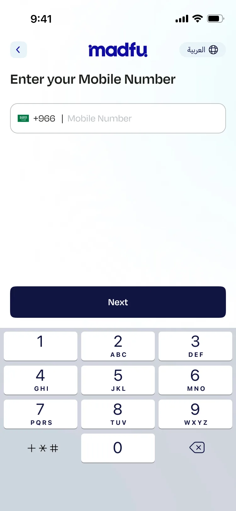
Mobile Number
Entry point. One field, one action. The screen gets out of the way.
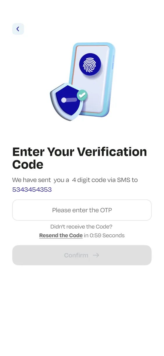
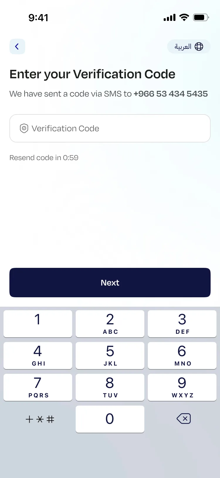
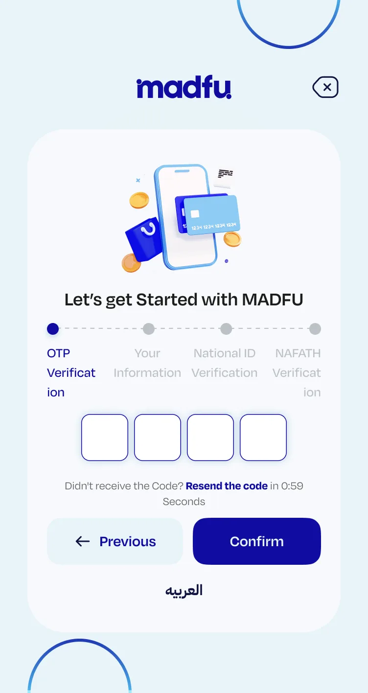
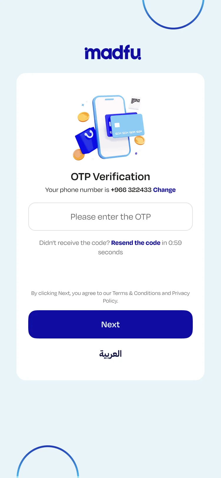
Verification Code
Confirms the exact number the user just entered. The copy reflects it back precisely, closing the loop immediately and removing any reason to second-guess.
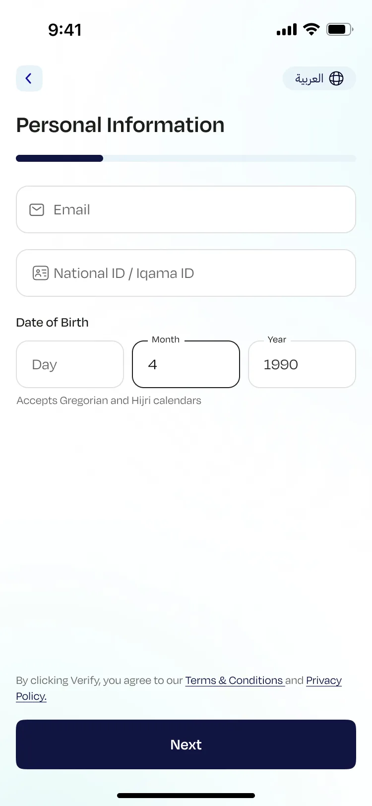
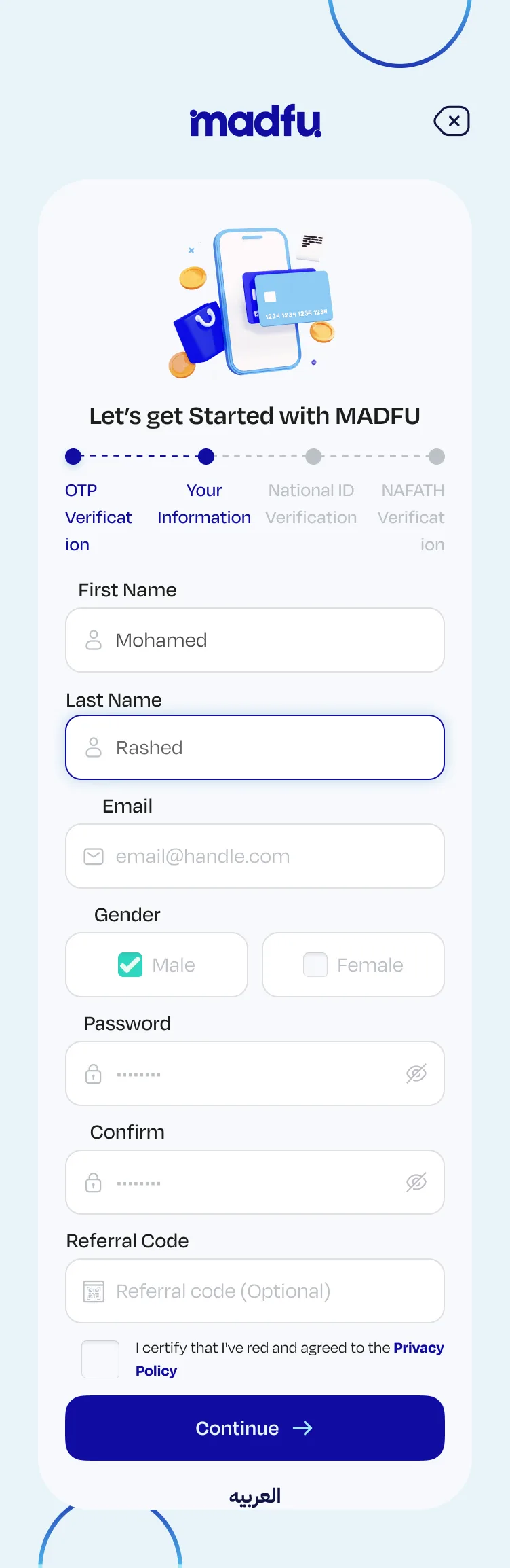
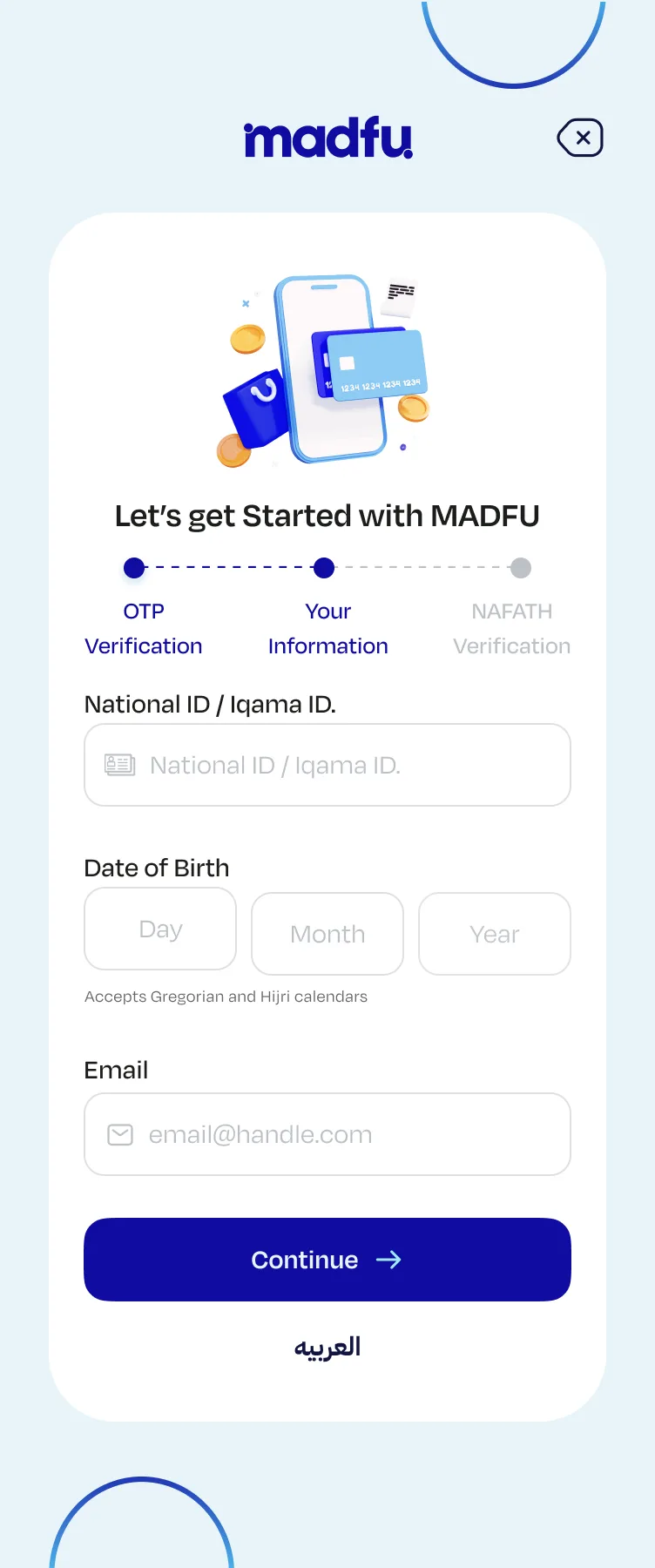
Personal Information
The progress bar appears here for the first time, giving users a visible sense of movement and distance remaining. The date of birth field accepts both Gregorian and Hijri calendars, a localization detail that matters in the Saudi market and signals that this product was built for its actual users.
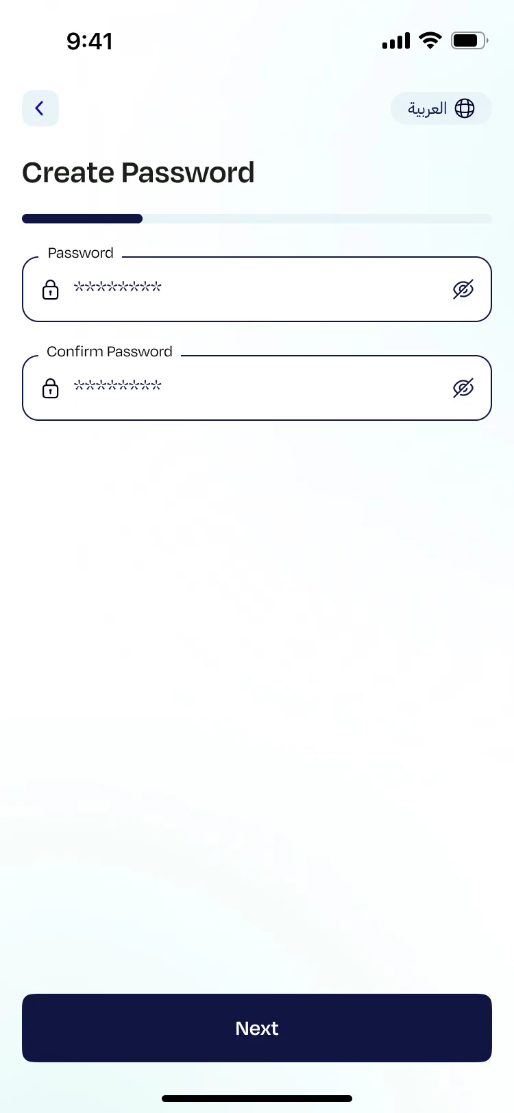
Create Password
Isolated on its own screen so it doesn't compete with anything else.
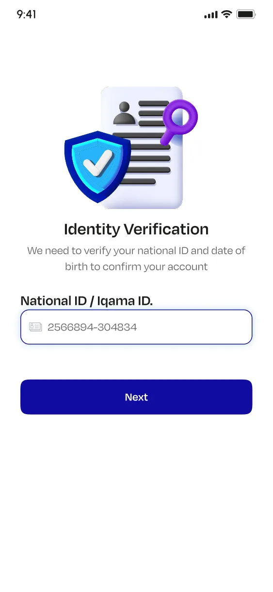
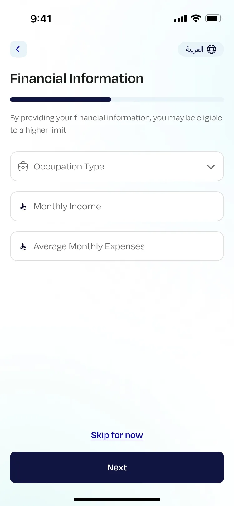
Financial Information
Made optional, with a clear reason to fill it in: "By providing your financial information, you may be eligible to a higher limit." The incentive stays visible. The choice stays with the user.
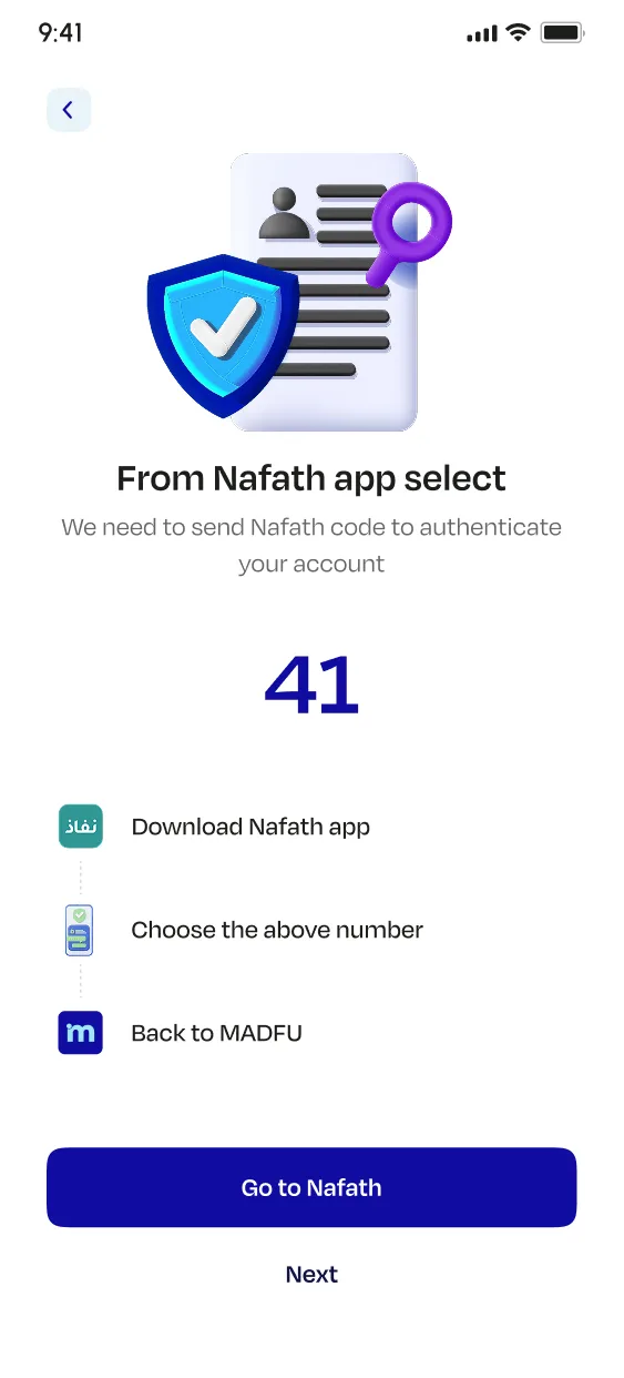
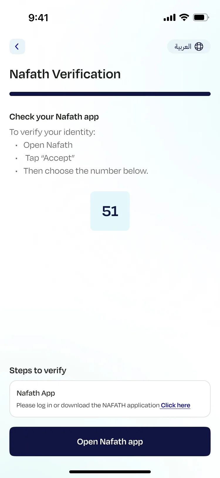
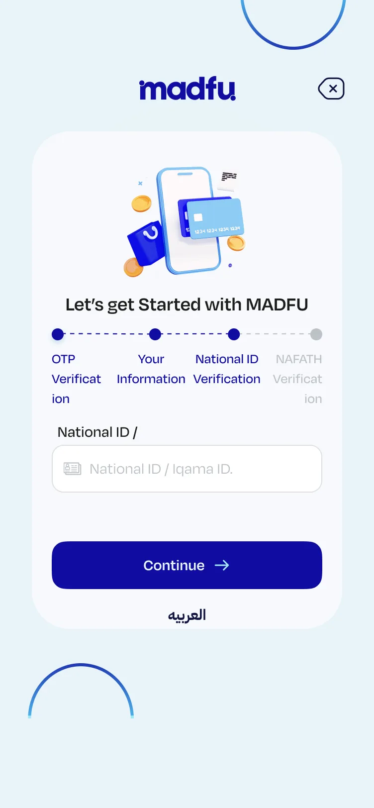
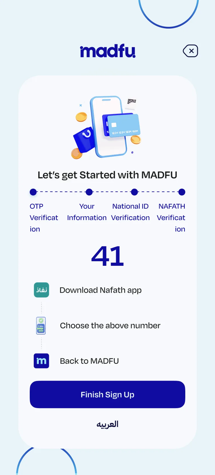
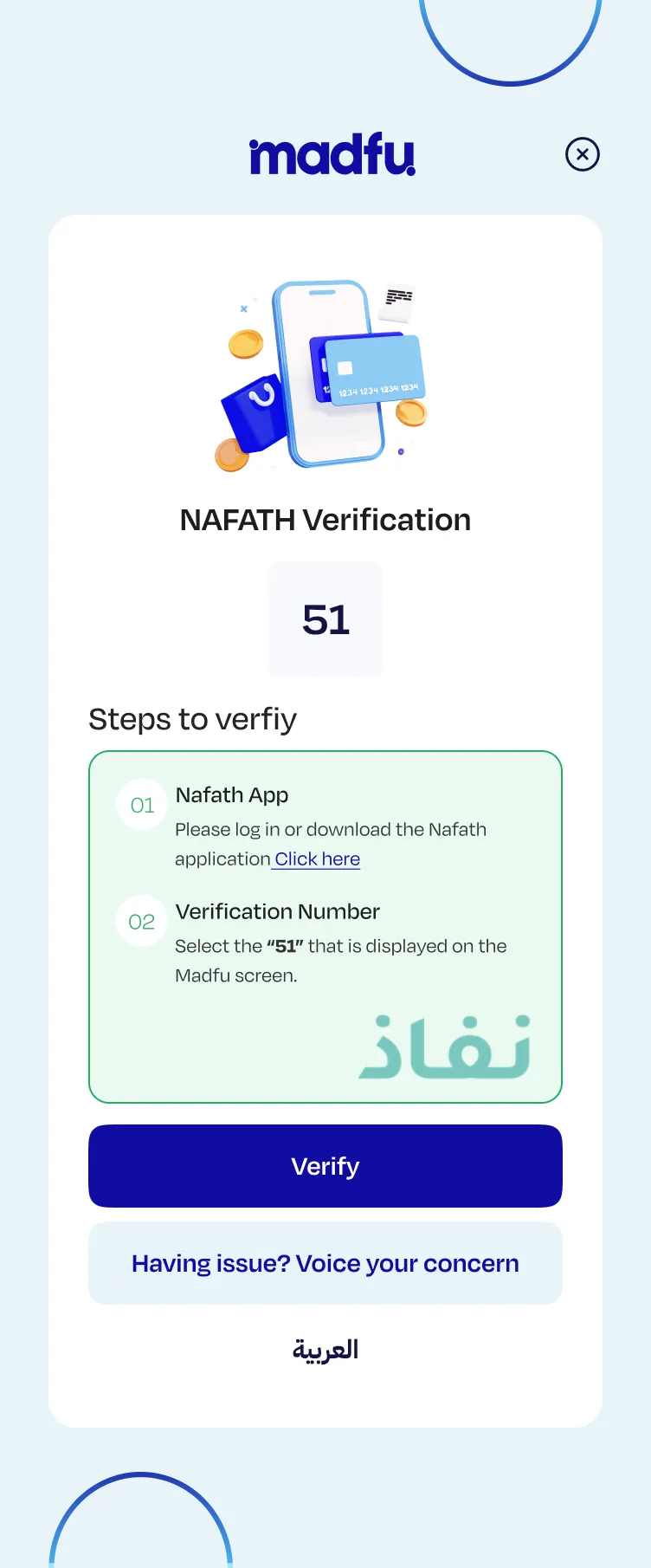
Nafath Verification
Nafath is Saudi Arabia's national digital identity verification system, essential for KYC compliance but unfamiliar to many users. The screen was rebuilt with three clear steps, a prominently displayed verification number, a single unambiguous CTA, and the progress bar sitting at near-complete so users can see they are almost done.
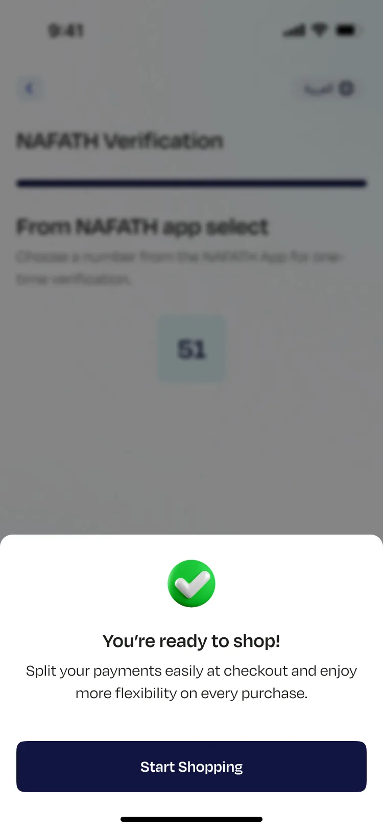
You're ready to shop
The finish line. A green checkmark, a human headline, and a reminder of what they just signed up for. Not "Account created successfully." A moment that actually feels like an arrival.
Redesigned consumer app — all screens in sequence
The iFrame — Same Standard, Different Stakes
The iFrame is not onboarding. It is clearance. The user is mid-purchase and every extra second of friction risks a lost transaction.
The redesigned iFrame flow has three steps. The phone number is now extracted directly from the merchant, so the user never has to type it. OTP confirms the number and moves forward. The information screen was stripped back to only what KYC requires at this stage: National ID or Iqama ID, date of birth, and email, with Hijri calendar support. Password setup is removed entirely and happens later inside the app. Financial information is not asked at checkout at all.
The Nafath screen was rebuilt with two clearly numbered steps, a prominent verification number, one primary CTA, and a secondary support option for users who get stuck at the most unfamiliar part of the process. Every field that was not strictly necessary for compliance at the point of purchase was cut.
Old iFrame — 5 steps, manual entry, overloaded form
New iFrame — 3 steps at checkout, then password in-app
Continues in app →
The Outcome
After launch, conversion through the KYC flow rose from 14.65% to 31.67%, more than doubling the completion rate with no change to acquisition spend or marketing activity. For a BNPL platform, every completed sign-up is a customer. Getting twice as many people through the door from the same number of starts is a direct business result.
What This Comes Down To
Fintech onboarding is a trust exercise disguised as a form.
Every screen asks the user to hand something over: their number, their ID, their income. If the product does not feel confident and clear at each step, people sense it and leave.
The work here was not about aesthetics. It was about removing every reason to stop, and making a complicated, regulated process feel like the easiest part of someone's day.