


The Challenge
Madfu Business is a financing portal for merchants who want access to working capital through Madfu. The product is essentially BNPL for businesses rather than consumers, and the sign-up requirements that come with it are set by compliance, not by preference. Every document, every verification step, every piece of identity information is there because it legally has to be.
The design challenge was not to simplify what compliance required. It was to make something that could not be made shorter feel like it was not as long as it actually is, and to make sure that when merchants did drop off, the business had enough information to bring them back.
The result is a flow that takes around 12 minutes to complete and covers everything compliance needs without losing the merchant along the way.
Two Surfaces, One Consistent Structure
The flow was designed across two distinct surfaces that needed to speak to each other without sharing a visual identity.
- Dark theme — signals seriousness and trust
- Clearly separate from the consumer Madfu app
- Registers as a financial product for business owners
- Guides merchants through a structured 4-step journey
- Light theme — internal tool, different audience
- Neither team ever mistakes which environment they're in
- Mirrors merchant form structure exactly
- BD team can step in at any point without disorientation
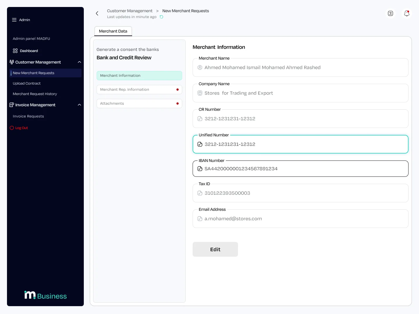
Both surfaces share the same three-section structure underneath: Merchant Information, Representative Information, and Attachments. This consistency was intentional. When a merchant's application is incomplete, the BD team sees exactly which fields are empty and can call the merchant to fill the gaps without confusion about what belongs where.
The Merchant Journey
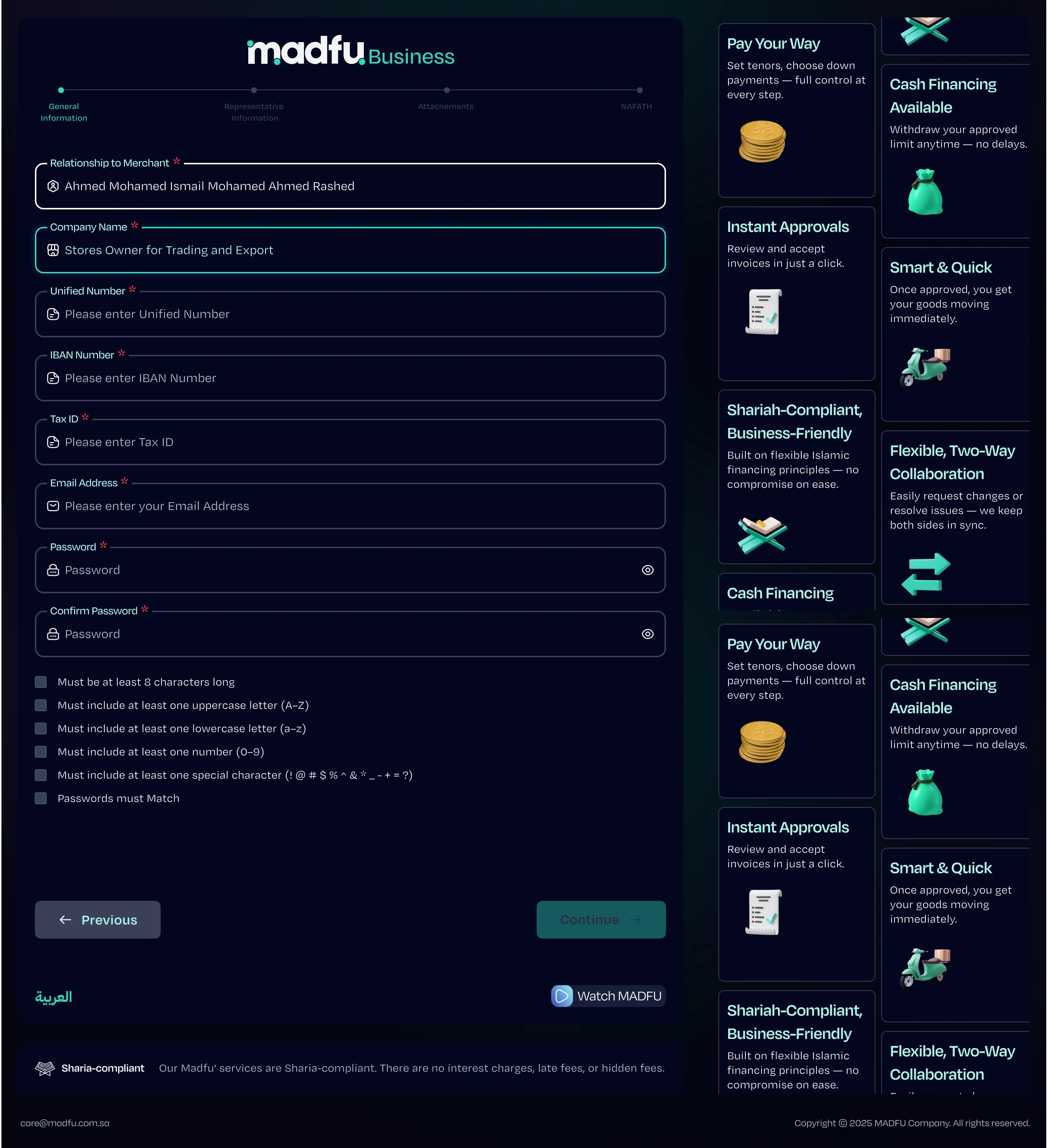
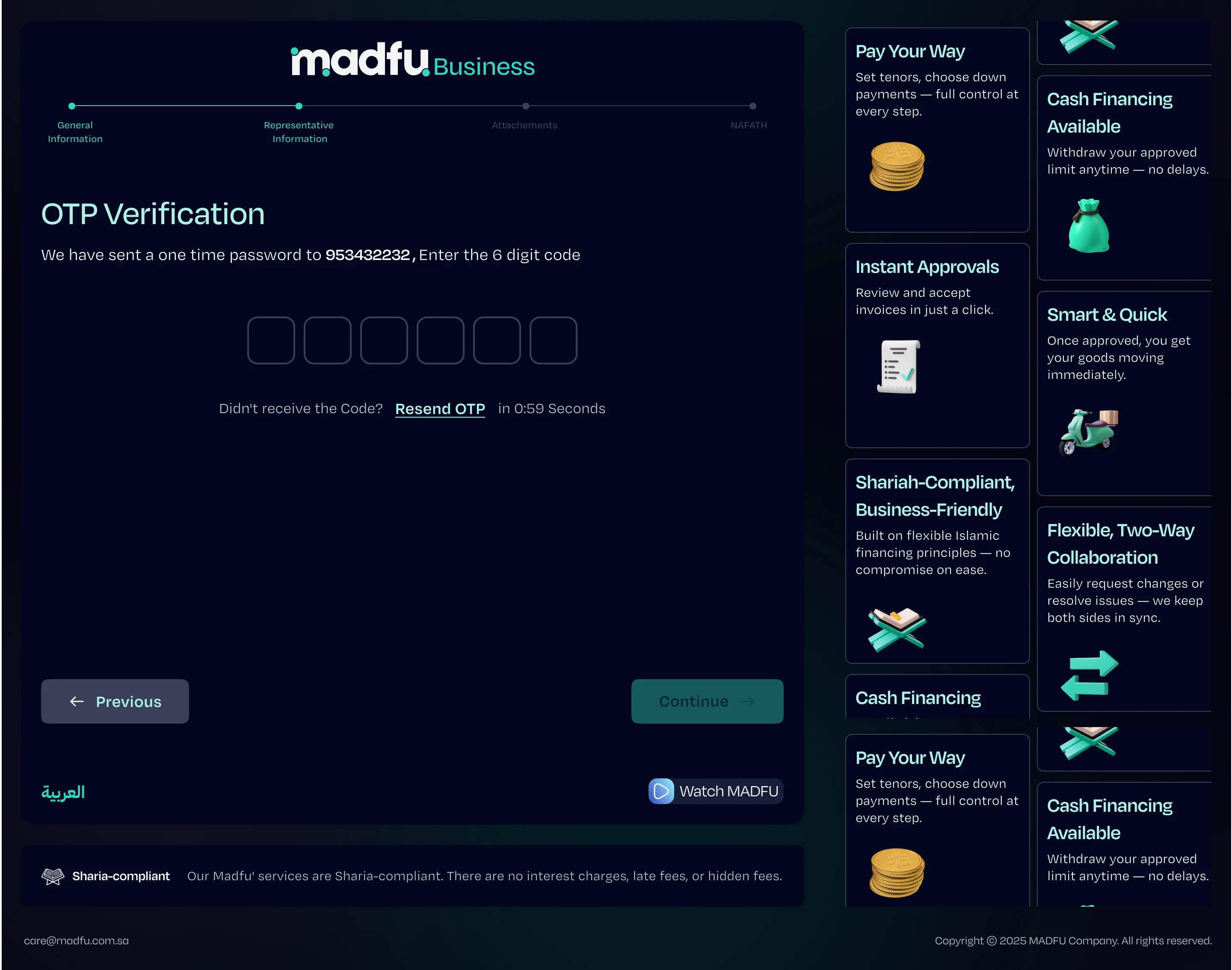
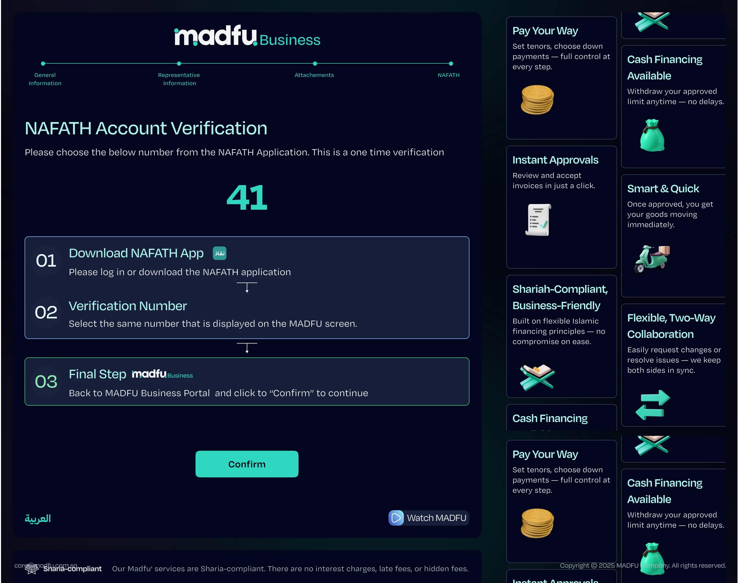
The flow is structured around four clearly named steps — General Information, Representative Information, Attachments, and Nafath — with a persistent progress bar keeping the end always in sight. Each screen is designed to handle exactly one thing.
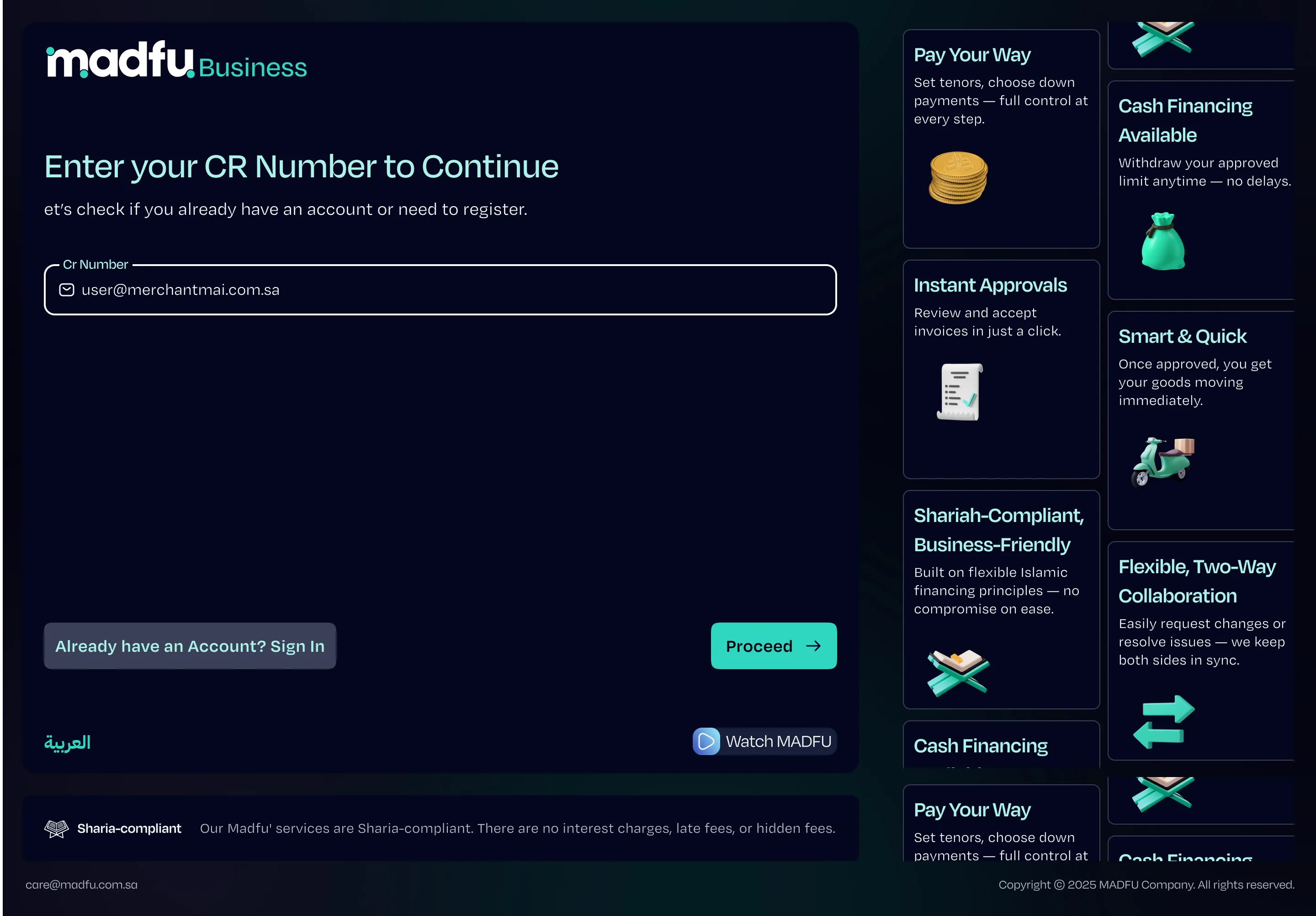
CR Number Check & Lead Generation
The flow opens with a single field: the merchant's Commercial Registration number. It checks whether they already have an account and routes them to sign-in if so — and acts as the first qualification gate before any personal information is asked for.
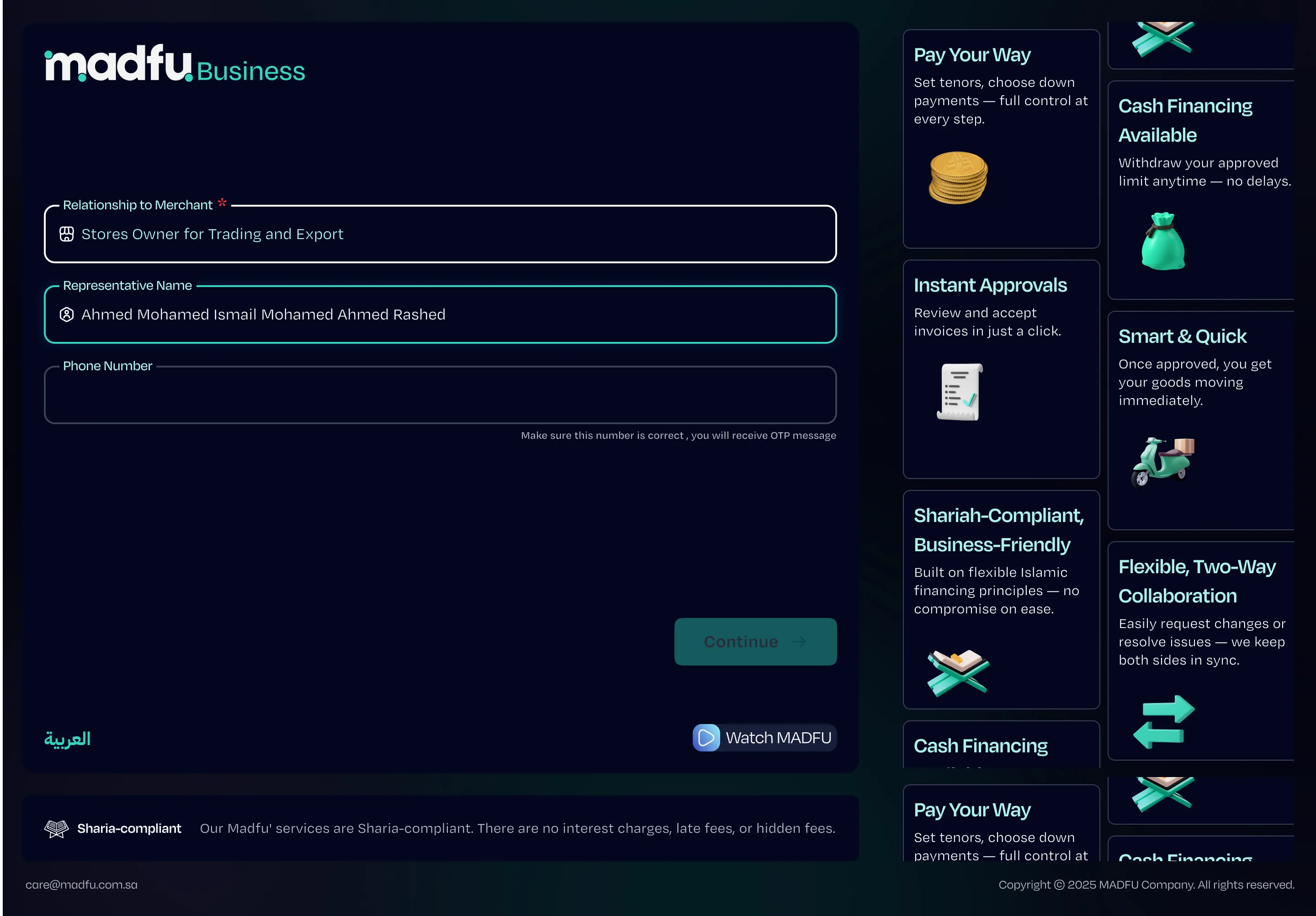
Before the full form begins, the flow captures the minimum viable information: the representative's name, their relationship to the merchant, and a phone number. This screen exists for one specific reason. If the merchant abandons at any point after this, the BD team has enough to follow up with a phone call and pick up where the merchant left off. Nothing is wasted.
General Information — Step 1 of 4
The first full step covers the business itself: company name, unified number, IBAN, Tax ID, email, and password. The password field uses live validation with visible requirements that check off in real time as the merchant types, reducing errors before submission rather than after.
A four-step progress bar runs across the top of every screen from this point forward. Merchants always know where they are and how much is left.
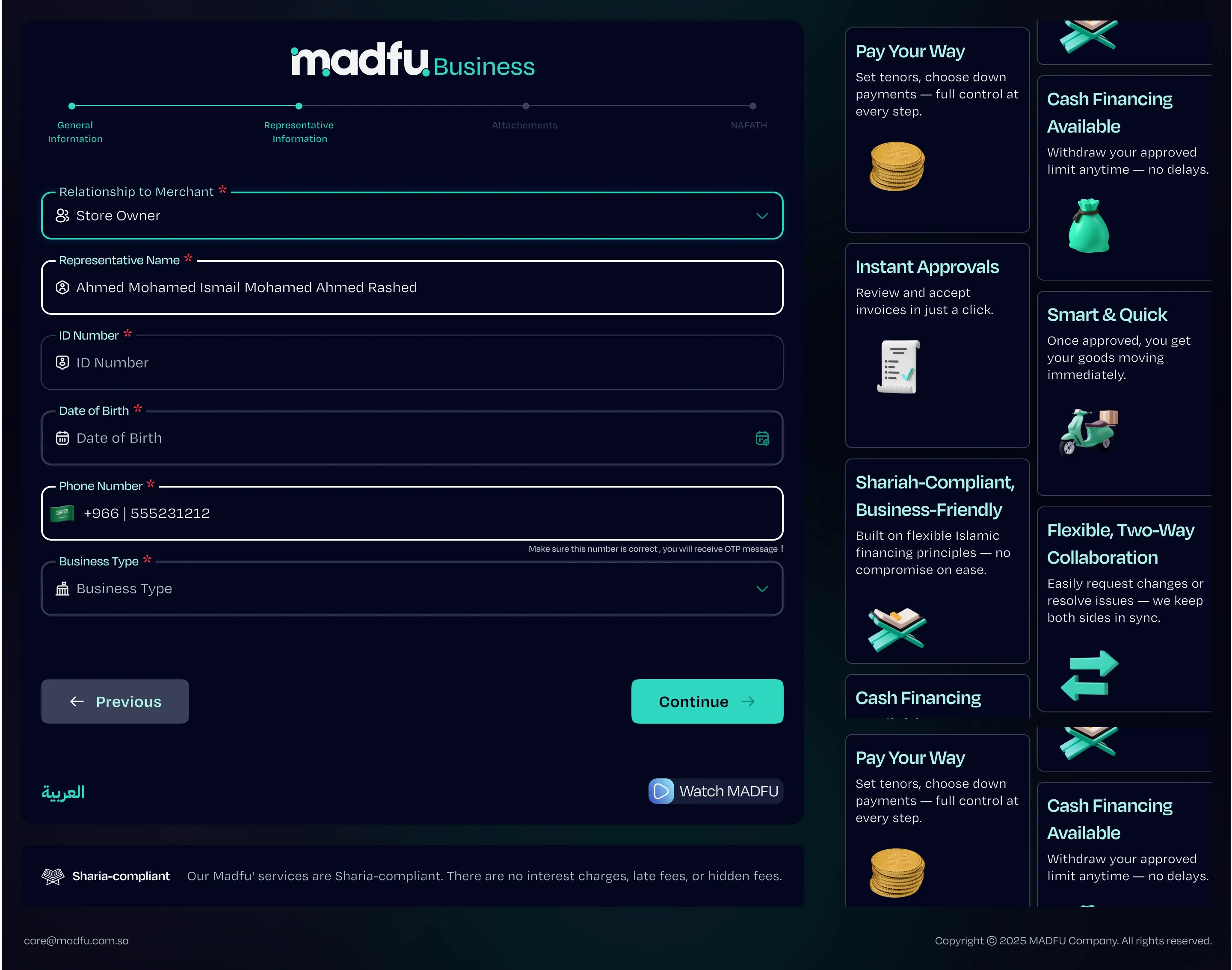
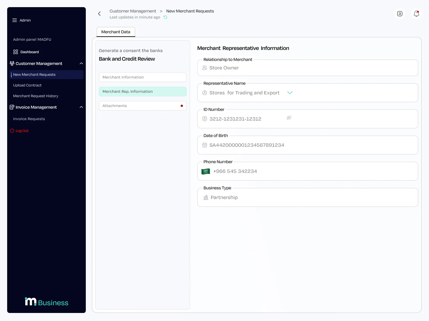
Representative Information — Step 2 of 4
This step covers the person completing the application rather than the business itself: their relationship to the merchant, full name, ID number, date of birth, phone number, and business type. The distinction between merchant information and representative information matters legally, and the two-step structure makes that distinction visible rather than burying it inside a single long form.
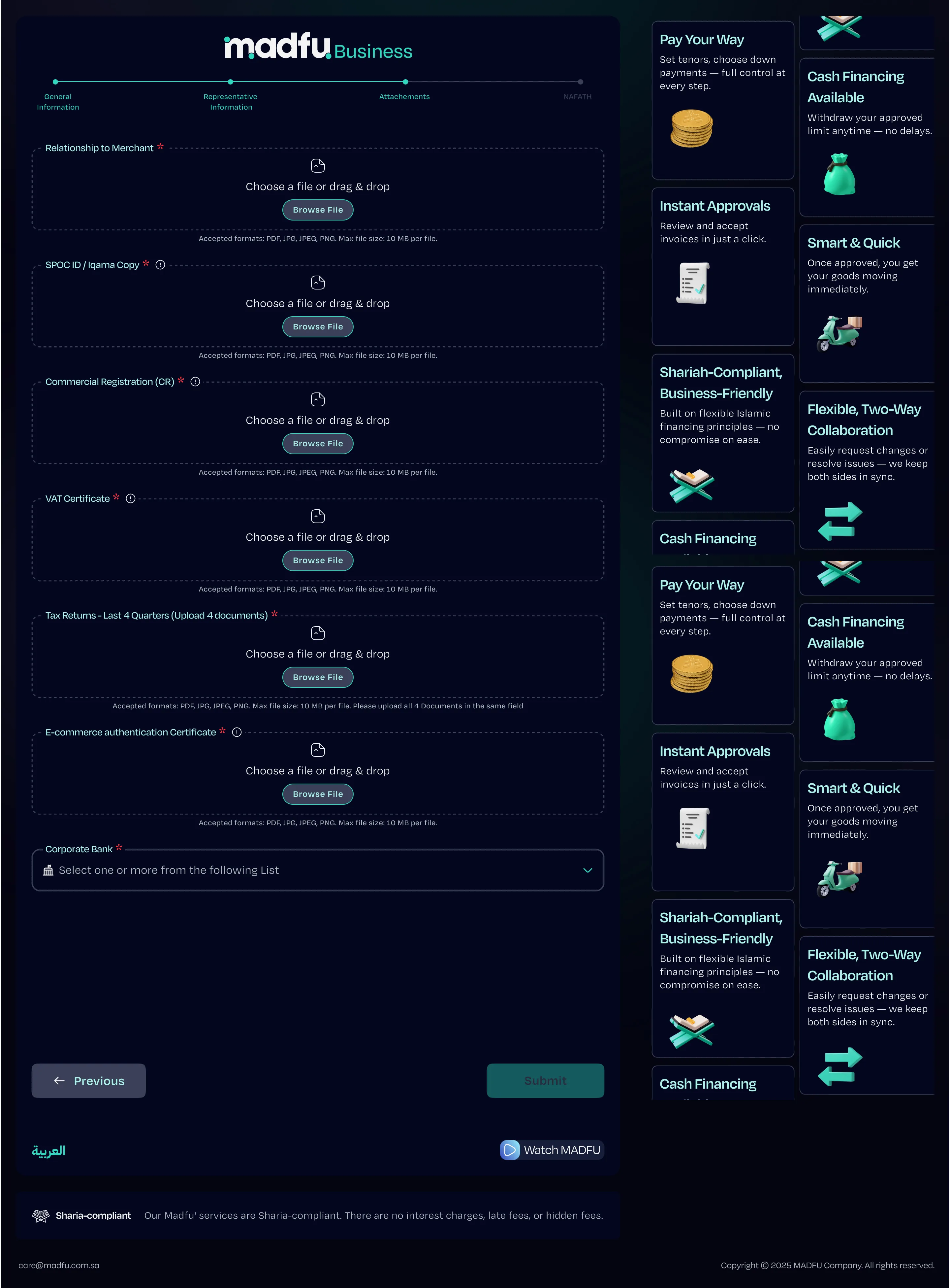
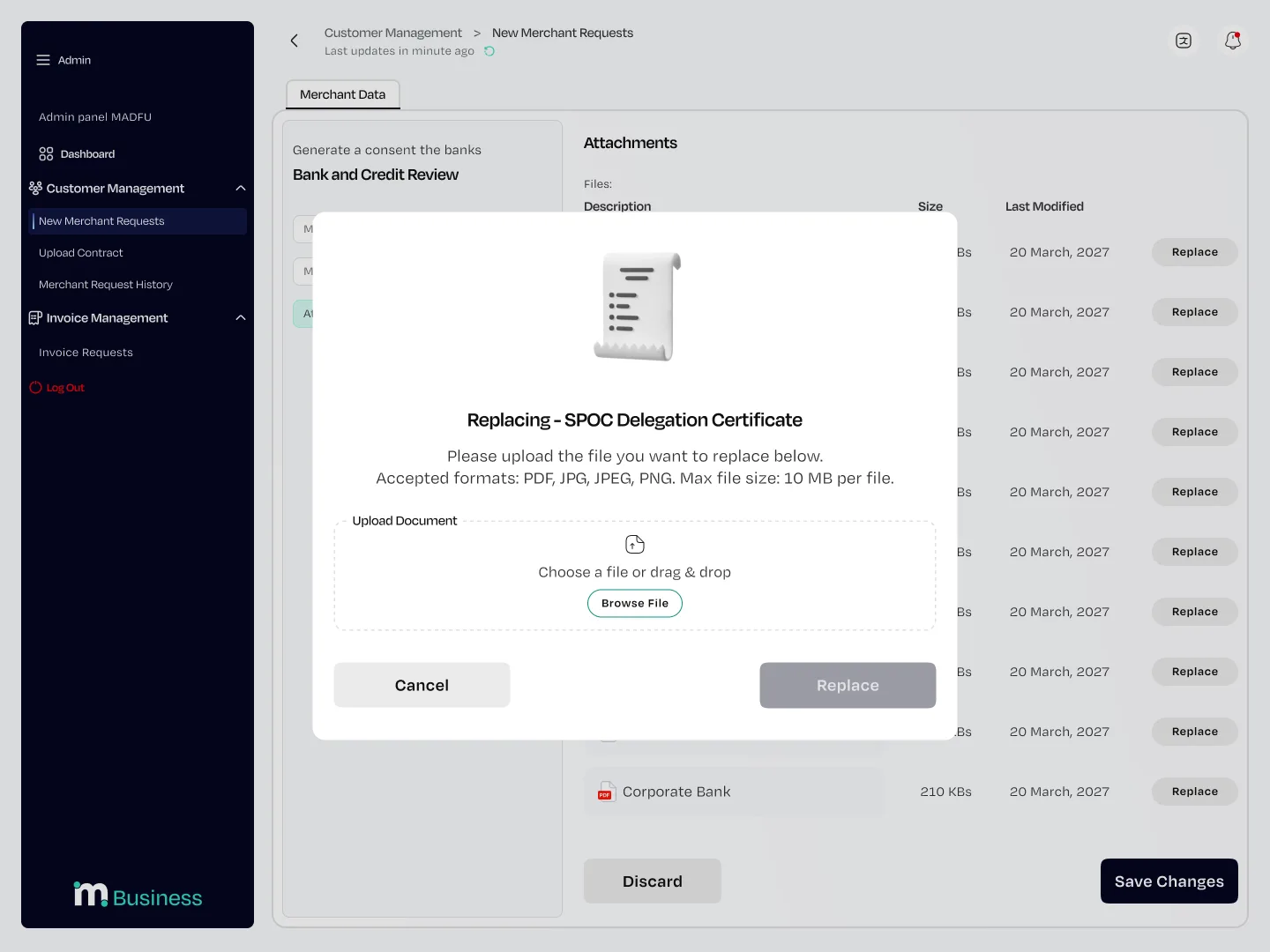
Attachments & Review — Steps 3 & 4
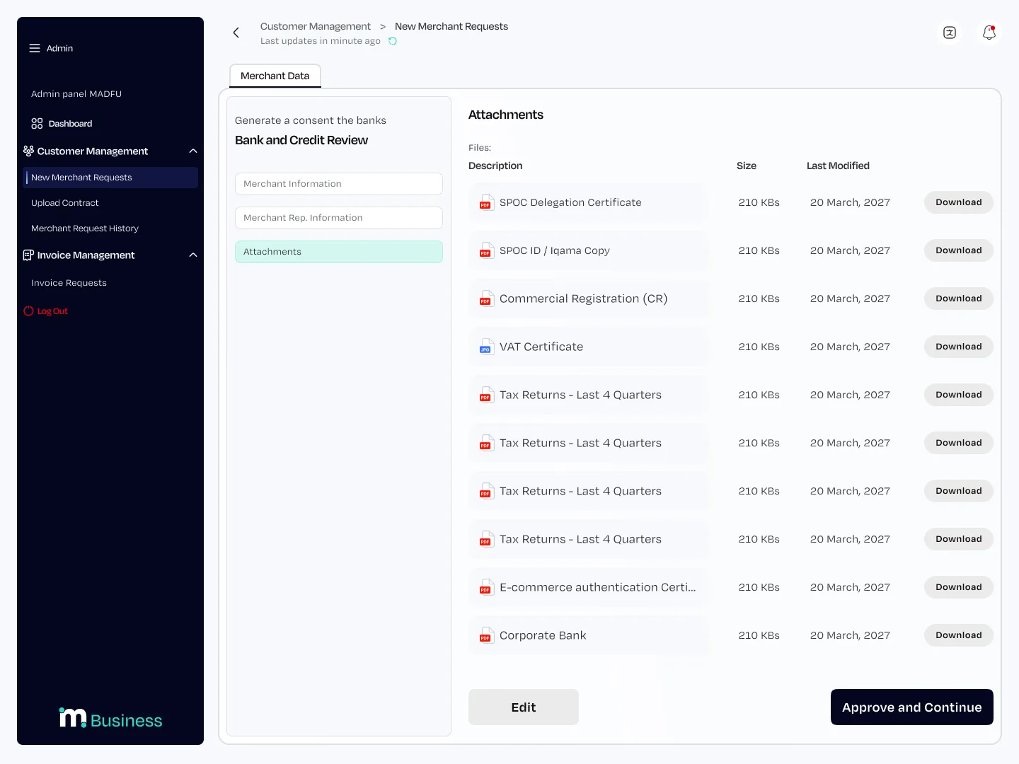
Seven document types are required by compliance: SPOC Delegation Certificate, SPOC ID or Iqama Copy, Commercial Registration, VAT Certificate, Tax Returns for the last four quarters, E-commerce Authentication Certificate, and Corporate Bank documentation.
There was no way to reduce this list. The design work here was in making each upload feel like a discrete completed task rather than an intimidating stack of requirements. Each field is clearly labeled, file format and size limits are stated upfront, and the progress bar makes the end of the form visible throughout.
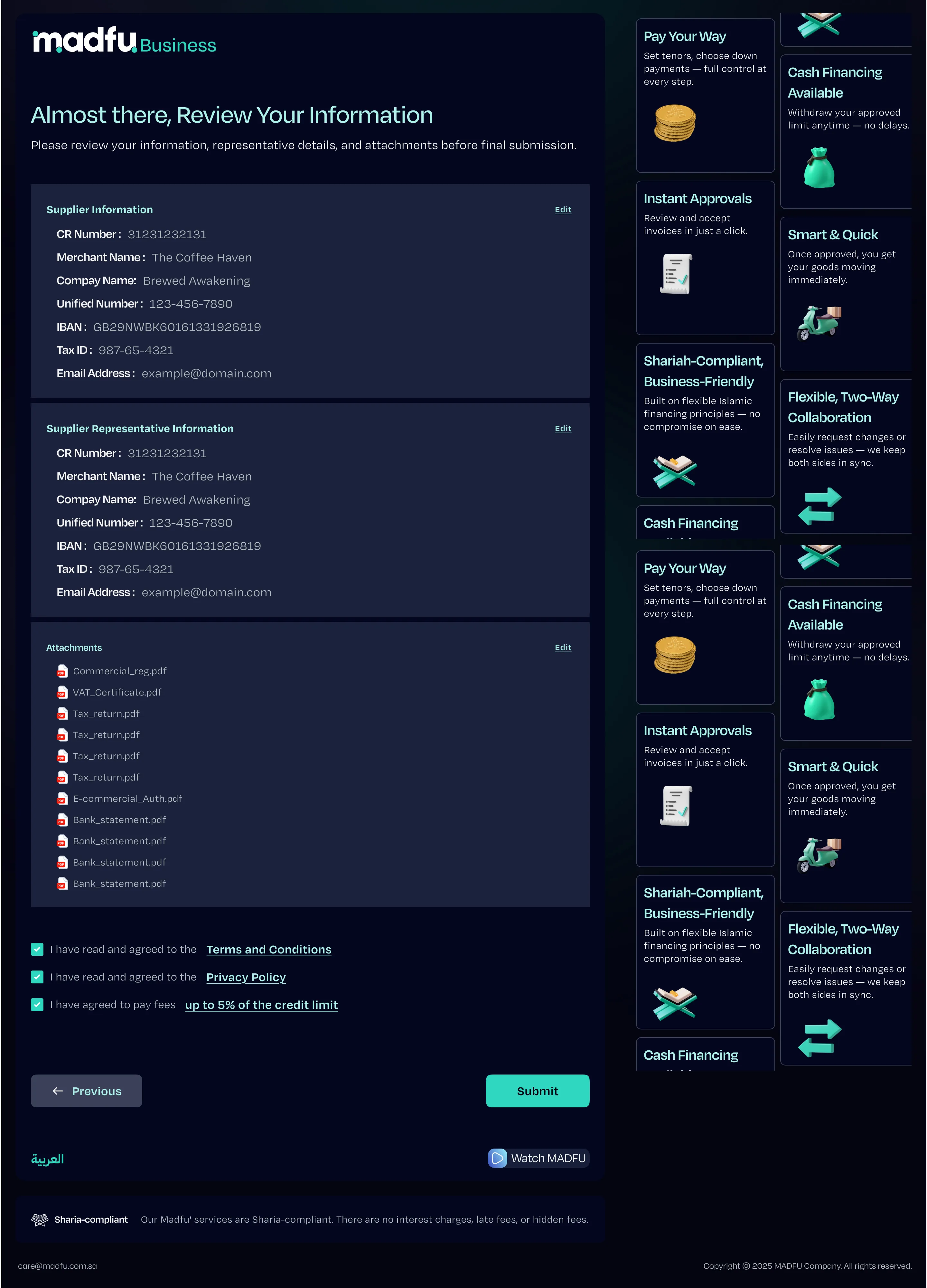
Before final submission, the merchant sees a full summary across all three sections — editable before anything is sent. Nafath verification closes the flow using the same three-step instruction format established in the consumer KYC work.
Merchant Portal — complete flow in sequence
The Business Development View
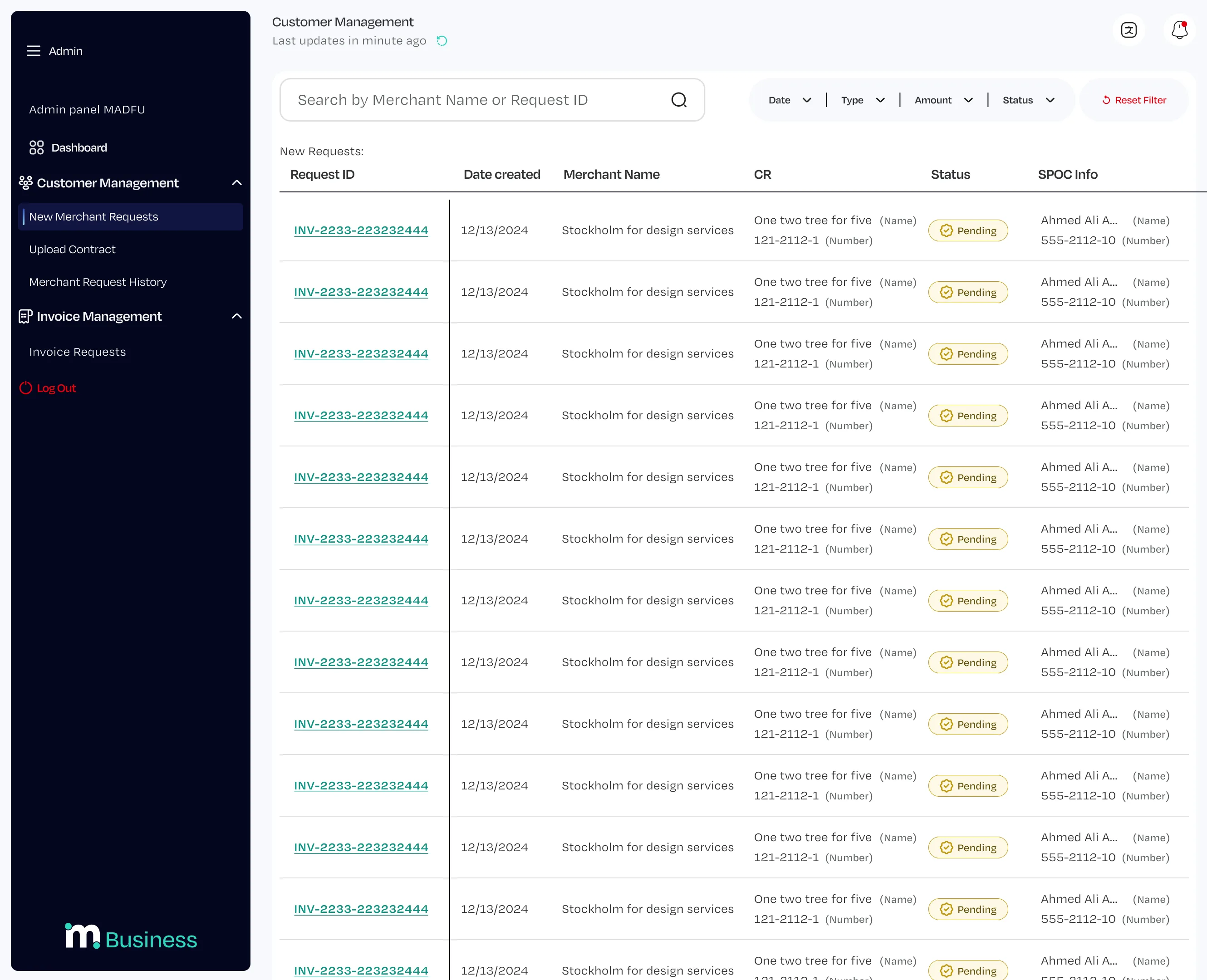
When a merchant submits or partially completes their application, it appears in the BD team's admin panel as a new request. The table shows Request ID, date, merchant name, CR number, current status, and SPOC contact information at a glance.
Opening any request reveals the same three-tab structure the merchant saw: Merchant Information, Representative Information, and Attachments. Fields where the merchant provided data are pre-filled and read-only. Fields where data is missing appear empty and editable, so a BD team member can call the merchant, collect what is needed, and complete the application on their behalf — without rebuilding anything from scratch.
What Made This Different
Most sign-up flows are designed around the question of what can be removed. This one was not. Everything in this flow is there because compliance requires it, and the design had to work within that constraint rather than around it.
The decisions that made the difference were smaller ones. Capturing lead information before the full form so no dropout is truly lost. Separating merchant and representative information so the legal distinction is visible to the person filling it in. Building the admin panel to mirror the merchant form exactly so the BD team can step in at any point without disorientation. Using a dark theme for the merchant portal and a light theme for the internal tool so both audiences always know which environment they are in.
Design Within Constraint
Compliance-driven design is different from every other kind of design problem. You cannot advocate for cutting requirements. You cannot push back on the document list. You cannot ask whether all of this is really necessary. It is. That's the premise.
What you can control is how it feels to go through it. The progress bar that makes the end visible from the beginning. The OTP mid-flow that creates a sense of forward movement at the right moment. The lead capture that makes the business case for never letting a dropout go cold.
The two-surface structure — dark for merchants, light for the BD team — is the most visible decision in the project. It solved a real problem: both audiences need to work in the same data without ever being confused about which environment they're in.
The flow diagram shows the real complexity underneath. The merchant doesn't see it. They see a clean, labeled, progress-tracked process that asks for one thing at a time and tells them exactly where they stand. That gap between the complexity underneath and the simplicity on screen is the design work.